
Introduction
Radar charts, which are also referred to as spider charts or radar plots, are a data visualization used to compare observations with multiple quantitative variables. Each variable is encoded to a spoke which are equidistant apart. The higher the value, the further away from the center of the chart the point is made. Radar charts are best used to compare the ‘profile’ of observations and to detect outliers within the data. They are therefore used quite a bit in sports, most notably in basketball and soccer for profiling players.
In this tutorial I will be teaching you how to build your own radar chart with JavaScript and how to use them to help with one of the toughest decisions in gaming history: which starting pokemon to choose!
That’s right, we will be building radar charts to perform data analysis on Bulbasaur, Charmander and Squirtle to determine, once and for all, which is the best choice.
Building a JavaScript radar chart
To build our radar charts we will be using a charting library. Charting libraries remove a lot of the burden of building charts (compared to something like d3.js) and allow you to get a chart up quickly and easily. For this tutorial I’ve chosen to use AnyChart JavaScript library. I’ve chosen AnyChart because building charts with it is really quick and it’s a awesome library for beginners because of the pretty intensive documentation.
Step 1: Setup the page
The first step to create our radar charts is to setup the html page and load the required scripts.
<html>
  <head>
    <script src="https://cdn.anychart.com/releases/8.7.1/js/anychart-core.min.js">     </script>
    <script src="https://cdn.anychart.com/releases/8.7.1/js/anychart-radar.min.js"></script>
    <style type="text/css">
      html, body, #container {
        width: 100%;
        height: 100%;
        margin: 0;
        padding: 0;
      }
    </style>
  </head>
  <body>
    <div id="container"></div>
    <script>
      anychart.onDocumentReady(function () {
        // drawing our chart goes here
      });
    </script>
  </body>
</html>
All I have done here is created a new html page, added the scripts required for creating a radar chart ‘anychart-core.min.js’ and ‘anychart-radar.min.js’. The former is required for all anychart charting and comes with the basic charts (scatter, bar etc) while the latter gives us the module required for building a radar chart.
We then create a CSS rule for our html page which sets the size of our chart. We have gone for 100% width and height and 0 margins to create a full screen data viz but if you want something different go ahead and change those values to something that better suits your needs.
Lastly, we use anychart.onDocumentReady(). Our chart will go in this function. What this does is it triggers the function only when the document is ready and not before.
Step 2: Load the data
In order to draw radar charts for our starter Pokemon we need to get the data. I found this at bulbapedia.bulbagarden.net (how cute?) which seems to have the stats for every Pokemon ever!
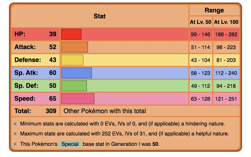
We then need to reformat this data into something that AnyChart knows how to read. AnyChart likes the data for each observation in the following format:
var data1 = [
  {x: "HP", value: 39},
  {x: "Attack", value: 52},
  {x: "Defense", value: 43},
  {x: "Special Attack", value: 60},
  {x: "Special Defense", value: 50},
  {x: "Speed", value: 65},
];
An array of objects with each variable having the x-axis variable to be named ‘x’ and the y-axis variable to be named ‘value’. In the radar chart’s case, the x-axis variable is the name of the variable while the y-axis variable is the value.
We repeat this step for each starter Pokemon resulting in the following three arrays:
var data1 = [
  {x: "HP", value: 39},
  {x: "Attack", value: 52},
  {x: "Defense", value: 43},
  {x: "Special Attack", value: 60},
  {x: "Special Defense", value: 50},
  {x: "Speed", value: 65},
 ];

var data2 = [
  {x: "HP", value: 45},
  {x: "Attack", value: 49},
  {x: "Defense", value: 49},
  {x: "Special Attack", value: 65},
  {x: "Special Defense", value: 65},
  {x: "Speed", value: 45},
];

var data3 = [
  {x: "HP", value: 44},
  {x: "Attack", value: 48},
  {x: "Defense", value: 65},
  {x: "Special Attack", value: 50},
  {x: "Special Defense", value: 64},
  {x: "Speed", value: 43},
];
Step 3: Drawing the chart
Now that we have all of our (psy)ducks in a row it is time to draw our chart.
// create radar chart
var chart = anychart.radar();

// set chart title
chart.title("Starter Pokemon Comparison Chart");

// set chart yScale settings
chart.yScale()
  .minimum(0)
  .maximum(100)
  .ticks({'interval':20});

// create first series
chart.line(data1)
// create second series
chart.line(data2)
// create third series
chart.line(data3)

// set container id for the chart
chart.container('container');
// initiate chart drawing
chart.draw();
Which results in:
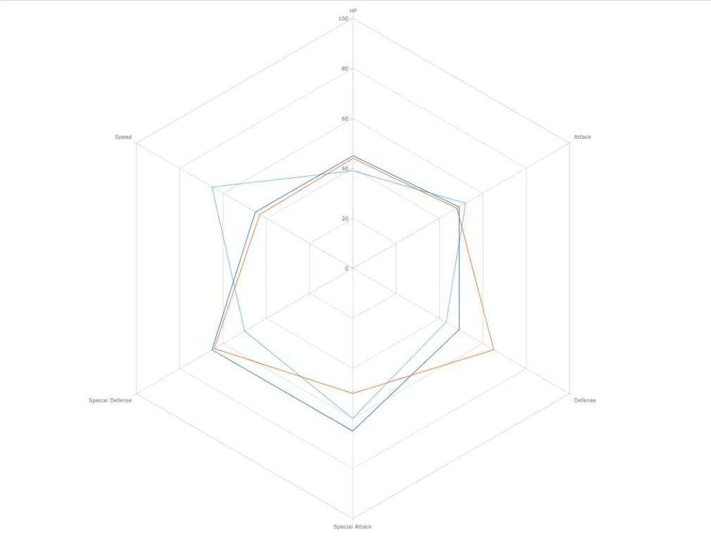
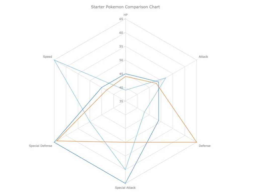
This doesn’t look too informative does it? The different series all look the same. We can easily fix this though. If we change the minimum and the maximum yScale values we will be able to see the differences between our 3 series much better. I then set the maximum value to 65 and the minimum value to 35, I chose these values based on the data I am trying to visualize. If one of our pokemon had a variable with a value higher than 65 or lower than 35 I would have chosen different values to accommodate that.
// set chart yScale settings
chart.yScale()
  .minimum(35)
  .maximum(65)
  .ticks({'interval':5});
Which results in this:
<html>
  <head>
    <script src="https://cdn.anychart.com/releases/8.7.1/js/anychart-core.min.js"></script>
    <script src="https://cdn.anychart.com/releases/8.7.1/js/anychart-radar.min.js"></script>
    <style type="text/css">
      html, body, #container {
        width: 100%;
        height: 100%;
        margin: 0;
        padding: 0;
      }
    </style>
  </head>
  <body>
    <div id="container"></div>
  </body>
  <script>
    anychart.onDocumentReady(function () {
    // our data from bulbapedia
      var data1 = [
        {x: "HP", value: 39},
        {x: "Attack", value: 52},
        {x: "Defense", value: 43},
        {x: "Special Attack", value: 60},
        {x: "Special Defense", value: 50},
        {x: "Speed", value: 65},
      ];

      var data2 = [
        {x: "HP", value: 45},
        {x: "Attack", value: 49},
        {x: "Defense", value: 49},
        {x: "Special Attack", value: 65},
        {x: "Special Defense", value: 65},
        {x: "Speed", value: 45},
      ];

      var data3 = [
        {x: "HP", value: 44},
        {x: "Attack", value: 48},
        {x: "Defense", value: 65},
        {x: "Special Attack", value: 50},
        {x: "Special Defense", value: 64},
        {x: "Speed", value: 43},
      ];

      // create radar chart
      var chart = anychart.radar();
      // set chart yScale settings
      chart.yScale()
        .minimum(35)
        .maximum(65)
        .ticks({'interval':5});

      // create first series
      chart.line(data1)
      // create second series
      chart.line(data2)
      // create third series
      chart.line(data3)

      // set chart title
      chart.title("Starter Pokemon Comparison Chart");

      // set container id for the chart
      chart.container('container');
      // initiate chart drawing
      chart.draw();

    });
  </script>
</html>
WAY better. We can now differentiate between our series.
Step 4: Customizing the chart
As I just showed you above, by changing an aspect of the chart I made it much more engaging and informative. It is your job as a data visualization developer to use all the tools at your disposal to help tell your data story in a better way.
Any charting library worth their salt has means of customizing their charts to allow you to better tell your story. I will now go through a few customization techniques to get more out of my radar chart.
Cell Color
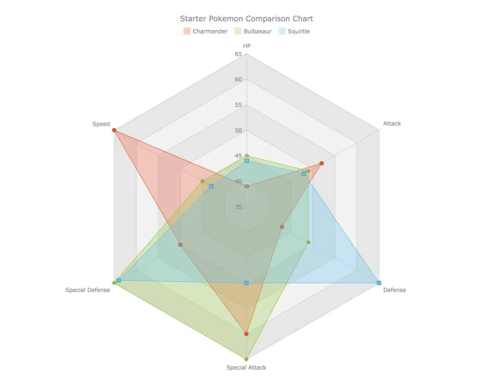
One of the disadvantages of using a radar chart is that it is hard to compare the values between different variables (because they are cyclically positioned instead of linearly positioned). We can mitigate this disadvantage somewhat by coloring alternating cells to create references to better compare variables.
// color alternating cells
chart.yGrid().palette(["gray 0.1", "gray 0.2"]);
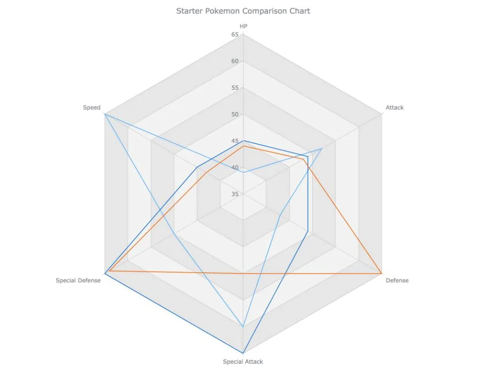
This code colors the radar cells gray with the alternating cells having different opacities.
Using opacity is a well known trick to having different colors which go well together.
Area, Fill, Stroke and Legend
In order to profile our different series better I will change the series type from line to area. This will allow us to change the fill of the polygon. I will also be changing the colors of each series to better represent the Pokemon in question.
// create first series
chart.area(data1).name('Charmander').markers(true).fill("#E55934", 0.3).stroke("#E55934")
// create second series
chart.area(data2).name('Bulbasaur').markers(true).fill("#9BC53D", 0.3).stroke("#9BC53D")
// create third series
chart.area(data3).name('Squirtle').markers(true).fill("#5BC0EB", 0.3).stroke("#5BC0EB")
A legend would also allow us to tell which series is which.
// set chart title
chart.title("Starter Pokemon Comparison Chart");
  // set legend
  .legend(true);
Rearrange Variables
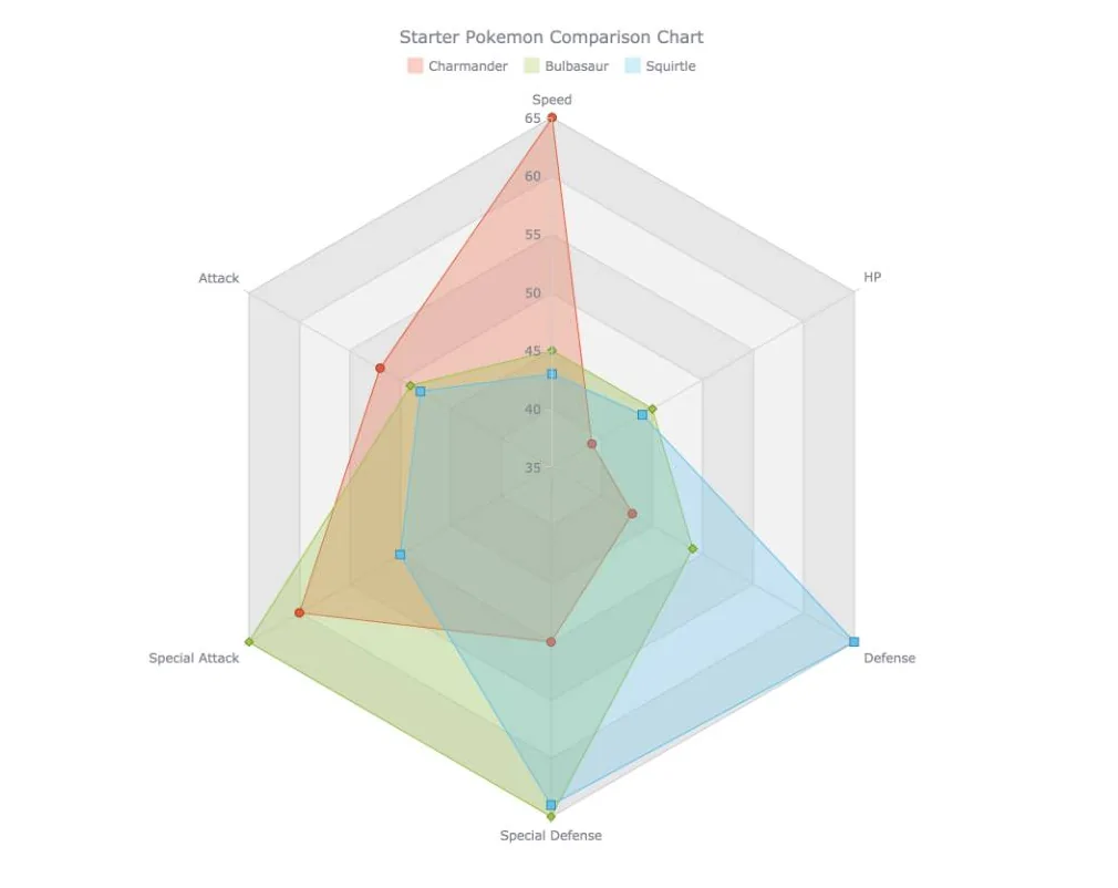
Another issue with radar charts is that users tend to see connections between neighbouring variables which isn’t the case. This is unfortunate and not much can be done about it however we can try and make the most of that and rearrange our variables so that variables which are more related are next to each other. This would further strengthen the use of the radar chart to see analytical ‘profiles’.
In our example we would rearrange this:
var data1 = [
  {x: "HP", value: 39},
  {x: "Attack", value: 52},
  {x: "Defense", value: 43},
  {x: "Special Attack", value: 60},
  {x: "Special Defense", value: 50},
  {x: "Speed", value: 65},
];
To this
var data1 = [
  {x: "Speed", value: 65},
  {x: "HP", value: 39},
  {x: "Defense", value: 43},
  {x: "Special Defense", value: 50},
  {x: "Special Attack", value: 60},
  {x: "Attack", value: 52},
];
As you can tell this is more of an art than a science. But as you can see below we get a much better picture of our different profiles.
<html>
  <head>
    <script src="https://cdn.anychart.com/releases/8.7.1/js/anychart-core.min.js"></script>
    <script src="https://cdn.anychart.com/releases/8.7.1/js/anychart-radar.min.js"></script>
    <style type="text/css">
      html, body, #container {
        width: 100%;
        height: 100%;
        margin: 0;
        padding: 0;
      }
    </style>
  </head>
  <body>
    <div id="container"></div>
  </body>
  <script>
    anychart.onDocumentReady(function () {
      // our data from bulbapedia
     var data1 = [
       {x: "Speed", value: 65},
       {x: "HP", value: 39},
       {x: "Defense", value: 43},
       {x: "Special Defense", value: 50},
       {x: "Special Attack", value: 60},
       {x: "Attack", value: 52}
     ];

     var data2 = [
       {x: "Speed", value: 45},
       {x: "HP", value: 45},
       {x: "Defense", value: 49},
       {x: "Special Defense", value: 65},
       {x: "Special Attack", value: 65},
       {x: "Attack", value: 49}
     ];

     var data3 = [
       {x: "Speed", value: 43},
       {x: "HP", value: 44},
       {x: "Defense", value: 65},
       {x: "Special Defense", value: 64},
       {x: "Special Attack", value: 50},
       {x: "Attack", value: 48}
     ];

     // create radar chart
     var chart = anychart.radar();

     // set chart yScale settings
     chart.yScale()
       .minimum(35)
       .maximum(65)
       .ticks({'interval':5});

      // color alternating cells
      chart.yGrid().palette(["gray 0.1", "gray 0.2"]);

      // create first series
      chart.area(data1).name('Charmander').markers(true).fill("#E55934", 0.3).stroke("#E55934")
      // create second series
      chart.area(data2).name('Bulbasaur').markers(true).fill("#9BC53D", 0.3).stroke("#9BC53D")
      // create third series
      chart.area(data3).name('Squirtle').markers(true).fill("#5BC0EB", 0.3).stroke("#5BC0EB")

      // set chart title
      chart.title("Starter Pokemon Comparison Chart")
        // set legend
        .legend(true);

      // set container id for the chart
      chart.container('container');
      // initiate chart drawing
      chart.draw();

    });
  </script>
</html>
We can clearly see that Charmander is more offensive, squirtle more defensive and bulbasaur is more well rounded. And therefore I would say that using this chart (and I realise how this is an anti-climactic conclusion) we can clearly see that all of the Pokemon are the correct choice. They are all pretty well balanced and all have their own strengths and weaknesses.
Conclusion
Making a radar chart is clearly a lot easier than most people think and I think the results are very cool and engaging. They are however trickier than other data visualizations to use and have a number of disadvantages.
If there are too many variables the chart becomes hard to read. If there are too many observations it is advised to separate them onto their own chart. They also need all variables to have the same scale. Also note that users tend to perceive the area of the observations as a measure of value and unfortunately that is often not the case.
With these caveats in mind I would suggest using a line or bar chart instead. Where radar charts really shine is that they are probably a lot stronger than line and bar charts at drawing a user in, so when they work, they work very well!
src: Building a JavaScript Radar Chart
author Wayde Herman