Intro
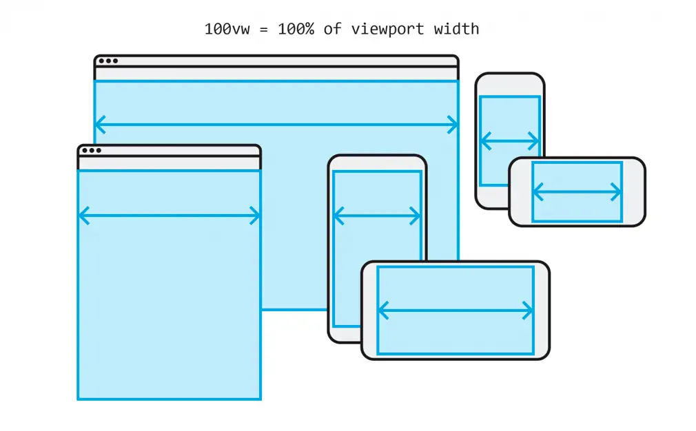
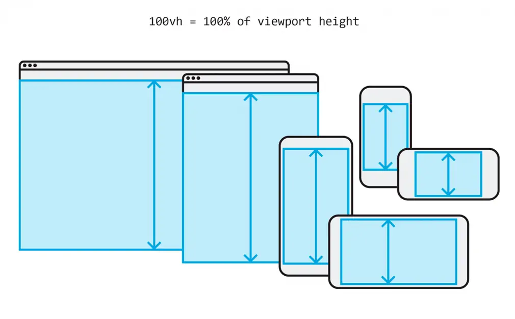
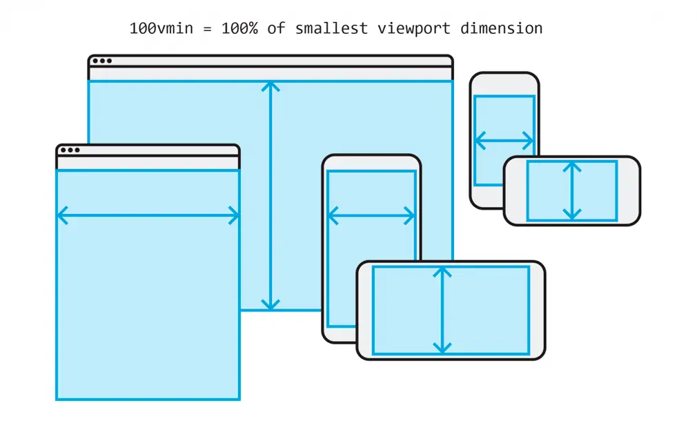
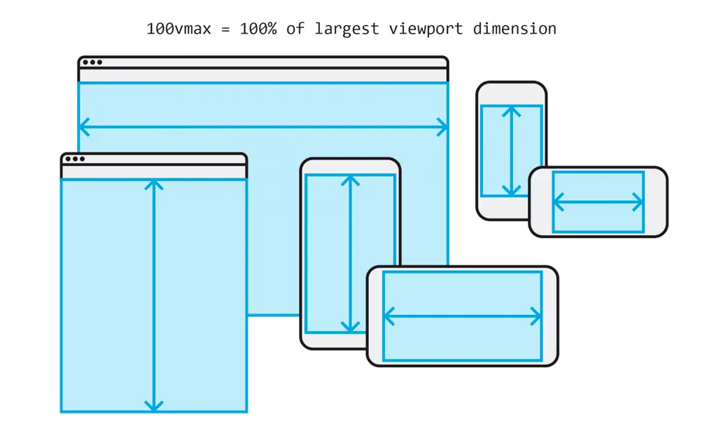
The days of fixed-width designs and needing to only test against a handful of viewport sizes are gone. We live in a fluid-width world with a myriad of device sizes and aspect ratios. Percentage-based units allow us to accommodate the variety of possible ways our content will be viewed, but they don’t work in every scenario. Viewport percentage units units, or “viewport units” for short, offer an alternative “fluid” value to use when percentage-based units prove inadequate. For example, viewport units can be useful when trying to create an equal height/width stack of elements.
Viewport units control attributes for elements on the page based on the size of the screen whereas percentages inherit their size from the parent element. For example, height: 100%; applied to an element is relative to the size of its parent. In contrast, height: 100vh will be 100% of the viewport height regardless of where the element resides in the DOM.
Let’s take a look at the syntax:


Now that we have the basic terminology laid out let’s look at an example.
Fixed-ratio cards
In this example, we will also leverage Flexbox to layout the width of our elements. Percentages fail us as it’s not possible to calculate the height of the items dynamically when the number of items in the list effects the height of their container. It is worth noting a similar result can also be achieved with intrinsic ratios. But by leveraging viewport units, we get the same effect with less code and without having to use absolute positioning.
.stack {
  display: flex;
  flex-wrap: wrap;
}

.stack__element {
  flex: 50vw;
  height: 50vw;
}
See on codepen. Try changing the height from 50vw to 50%, and observe the results.
Full-height elements
Viewport units shine when an image must scale to the height of the user’s screen. Without viewport units, we would need all the container elements of .image to have height: 100%; on them. Get the same result with less code:
.image {
  height: 100vh;
  width: auto;
}
See on codepen. Again, replace 100vh with 100% and see what happens.
Keeping an element shorter than the screen
In a similar manner vein, what if we want to force an element’s height to be shorter than the viewport? This technique can be useful if you want to explicitly control the height of an element relative to the viewport size so that it will always remain in view.
.shorten-me {
  max-height: 90vh;
}
See on codepen. To play with this, try reducing the width of the screen in codepen so that you have an extremely narrow viewport. Note the behavior of the text box.
Scaling text
Rem and Em give developers great flexibility when adjusting font sizes, but they do not scale dynamically with the viewport size. Though we can leverage the way rem inherits base font size from the root element, use a viewport unit on the root element’s font size, and scale with that.
Use this method carefully. Text could potentially become illegible as it scales with the viewport. In practice, media queries combine nicely with vh units to ensure readability across screen sizes. If you are going to implement something like this in your design, I highly recommend Zell Liew’s in-depth write up on viewport-based typography.
html {
  font-size: 16px;
}

h1 {
  font-size: calc(100% + 5vw);
}
Breaking out of the container
Viewport units make it possible to break outside of a containing element or elements. In scenarios where the CMS makes it difficult or impossible to alter our markup in an HTML template, using viewport units can achieve the desired result regardless of the markup. This technique won’t work in every scenario, but it’s a nice trick in some instances.
.container {
  max-width: 1024px;
  margin: 0 auto;
}

.breakout {
  position: relative;
  left: 50%;
  transform: translate(-50%, 0);
  width: 100vw;
}
Browser support and gotchas
Though there is solid support for viewport units across all major web browsers, you can still come across bugs including:
- Safari. One of the major problems you need to look out for is lack of support for viewport units inside
calc()in Safari 8 and below. - Some versions of Internet Explorer and Edge do not have complete support including no support for
vmaxyet. - Platforms, especially Windows, are inconsistent about how they count the width of the scrollbar across browsers.
- Chrome at this time does not evaluate viewport units when printing.
Because there are still a few bugs, it is always a good practice to check caniuse before implementing a newer technique in your design.
Conclusion
Viewport units are one of my favorite additions to browsers in recent years. Nevertheless, if there are places in your design where you do not want an element to change relative to the screen size then viewport units are not what you need. But if you want great flexibility in tailoring a site’s elements to a wide array of devices—viewport units are the perfect fit. I hope that using them will serve you.
src The Unexpected Power of Viewport Units in CSS
author Thomas Lattimore